From two sets of bank records to a result a finance team can trust
As senior product designer, I led the product direction and built the design system that turned a file-matching tool into a workflow, now live with paying customers, where a finance team can run a reconciliation, tell whether the result is safe to rely on, and resolve what didn’t match with a record of every decision.
- Role
- Senior Product Designer (contract)Product directionDesign systemAI experience
- Team
 EvanSenior product designer
- Franklin ElumProduct manager
- Victor OkadigboAI and data
 Tyrone OnyebuaguEngineering
- Timeline
- 2025
Every bank keeps two versions of its money. One is its own books: what it believes it paid and received. The other comes from outside: the statement from the bank that actually moved the cash. Reconciliation is checking that the two agree, line by line, and explaining every line that doesn’t.
Here’s one line, from the prototype’s sample data. On 5 August the books show a transfer of ₦215,400 to Oluwaseun Adeyinka. On 6 August the statement shows ₦215,400 leaving for the same person. Same money, same name. The software says they don’t match.
Here’s a whole day, from somewhere else: a sample run during testing. 20,822 of the bank’s 22,003 transactions found their pair, which is 94.63%. The same run’s summary flagged five hours, starting at midnight, with no settlement data at all. So some of the 1,181 open records could have been waiting on data that never arrived. Nobody could say which.
And in October, on a call with an asset manager we were talking to, most of what they needed was help with the records that didn’t match.
One line, one day and one call lead to the same question, and it’s the one this case study is about: how does an analyst know what an unmatched record actually needs?
MasteryHive builds reconciliation software for banks, microfinance banks and asset managers. I was the senior product designer, on contract, and I led the product direction for this work.
At a glance
What I owned. Product direction and design for reconciliation, end to end: starting a run, reading the result, the exceptions queue and its inspector, actions by type, the bulk bar, the agent’s queue and approved patterns, matching by hand, and report templates. I built the design system it’s made from, component by component, and a coded prototype of the whole product.
Who I worked with. Franklin Elum, product manager. Victor Okadigbo on AI and data. Tyrone Onyebuagu on engineering. Franklin ran the client calls and I was on them, so most of the feedback in this case study I heard first-hand.
Where it stands. Everything in this case study is live, and customers pay for it. The recordings come from my prototype of the same product with sample data, so no customer’s records appear here.
Jump to the run result · investigating one record · the bulk-action decision · impact
One screen to start
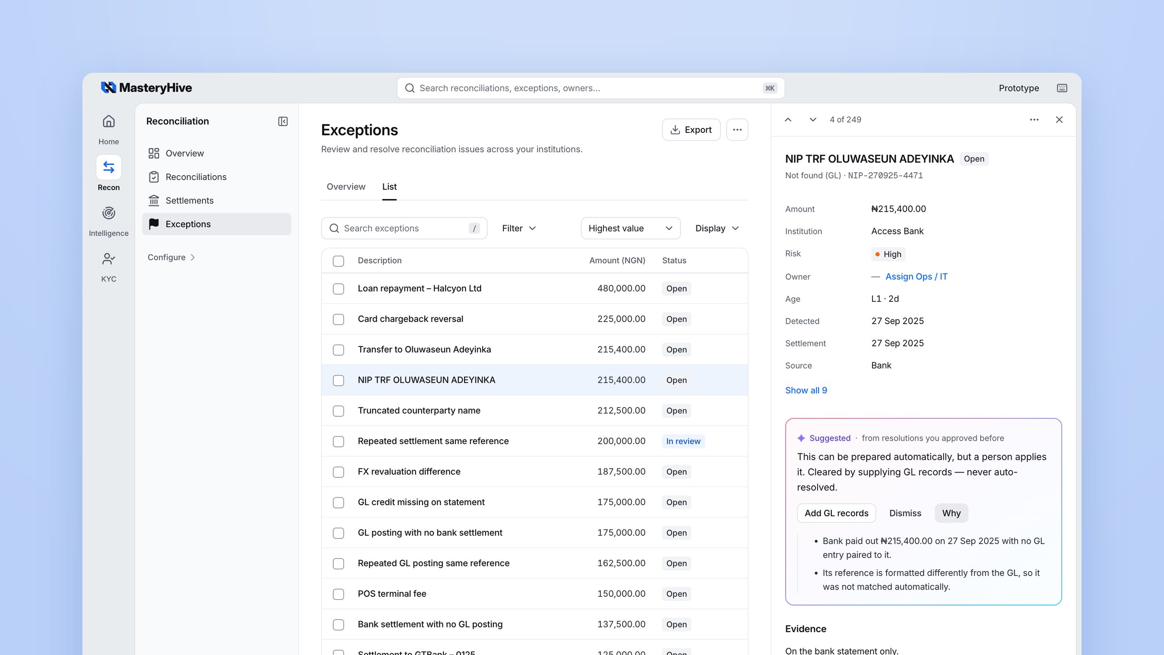
This is the exceptions queue with one record open: the bank’s side of that ₦215,400 transfer. Three details on it carry most of this case study.
Why two honest records disagree
Nothing went wrong with that payment. The two records still differ on almost every line, because two systems wrote it down for their own reasons.
Multiply that by twenty thousand lines a day. Add fees the bank takes on the way, payments that settle in batches, and reversals. That is the job.
Before a finance team can report on the result or close the books, they need three answers: which records agree, why the rest don’t, and whether the files they compared were complete. The expensive mistake is a false match. It closes a line that should have stayed open, and nobody looks at it again.
Where an analyst’s day starts
An analyst doesn’t start the day with a run. They start with what’s waiting. So the Overview opens on one short list, Needs attention: suggested actions to approve, exceptions old enough to escalate, chargebacks, data-quality problems, and work nobody owns.
Each line is a shortcut, not a report. “Review data quality” opens the exceptions queue already narrowed to that type, so the first click of the day lands on the first piece of work.
One limit, said plainly: these shortcuts don’t yet carry the period you were looking at, so the queue they open can hold more than the Overview counted. It’s on the list of things to fix.
The first brief was a pipeline
The first version followed the machine’s steps: upload two files, map the columns, run the match, download what came out. It answered “do the records agree?” and stopped.
Reviewing it with the team, I kept meeting questions the pipeline couldn’t answer. Which rules produced this match? Was the file complete? What do I do with the lines left over? So I laid the work out again, around what the analyst has to establish at each step, and what goes wrong quietly if the page doesn’t help.
Before the comparison runs
Setting up a run came down to two decisions.
The rules are saved, not set on every run. How many days apart two records can be, how far two amounts can differ: those rules decide every result, and in the early design the analyst set them each time. I moved them into Settings, owned by the people responsible for them and saved as a template for each kind of account. Starting a run means picking the template, and one line says what you just agreed to. An analyst can’t loosen a rule to push one stubborn run through. That’s the point. A rule changed quietly on a Tuesday is very hard to explain to an auditor in March.
An uncertain column is a question, not a guess. Every institution names its columns differently: “Money out”, “Payments”, “DR”. The agent reads both files’ headers and fills the ones it recognises, each with a small tag and a sample value, so you can see what it understood. A header it doesn’t recognise stays blank. It never guesses by position, and if you press Run with a gap, the page names the field that’s missing.
A wrong mapping is worse than a failed run, because a failed run is obvious. An amount read from the wrong column gives you a confident, tidy, wrong result.
The matcher’s order is written down in Settings as a fact, not a setting: the reference first when both sides carry one, then the amount within the tolerance, then the date within the search range. The description only ever confirms a pair. A difference in wording never breaks one.
94.63% sounds like a good day
Back to the sample run. It checked the bank’s 22,003 internal transactions against 23,059 settlement records, and 20,822 on the bank’s side found a pair. That’s where 94.63% comes from: matched records over the bank’s own total.
The same run’s summary flagged five hours with no settlement data, the hourly slots from 00:00 to 04:00. That doesn’t prove the gap explains any particular open record. It means some of the 1,181 could be waiting on data that never arrived, and the rate can’t tell you which.
This was the turning point for me. The match rate tells you how much agreed. It can’t tell you whether the comparison was fair.
Internal review, July 2026. We went through the results screen as a team, and the verdict was blunt. It was long, and it was all statistics. Every figure had the same weight, so the one that mattered most, five hours of missing data, sat at the bottom of the list.
I rewrote the summary as a sentence a finance lead could read aloud, and pulled the missing data out as its own warning. That rewrite is still a proposal. The prototype’s run page has a shorter summary from the agent, and the missing-data warning isn’t built yet.
What the prototype does have is the shape of the page. It keeps three things apart: whether the run finished, what matched, and what still needs a person. It opens on what needs attention, says why in plain words, then shows only the lines that differ. The fourth thing, whether the data was complete, is that warning, and it’s the next thing I’d build.
What does this row need next?
That leaves the records that didn’t match. In the first version they sat in a table, and a table can’t tell you what to do. A payment that’s late should wait for tomorrow’s file. A payment that’s missing needs the missing records. A payment that’s wrong needs a person. Give all three the same button and at least two get the wrong treatment.
So I stopped asking how to show unmatched rows and asked something else: what does this row need next?
Evidence shaped by the decision
The answer starts with the evidence, and the evidence depends on the decision it has to support. A split settlement and a missing record look alike in a list. They ask different questions.
A split settlement asks whether the parts add up. So its evidence lists both sides, totals the parts, and shows the difference, because both sides have amounts to subtract. A missing record asks which side is missing. So its evidence says so in words, “On the bank statement only”, marks the empty side, and shows no difference at all. There is nothing to subtract.
Both open on a verdict in words before any number, and only what differs is marked.
Two ways into one investigation
Back to the ₦215,400. In the old flow it was a line in a results table, and the table went away when the next run started. But the payment was still open. An exception can outlive the run that found it.
So exceptions got their own workspace. Reconciliation finds the problem. Exceptions owns what happens next. Each one arrives with the run it came from, both source records and the reason it was left open, so the person who picks it up on Thursday doesn’t have to rebuild Monday.
There are two ways in, and they meet at the same record. From a run, a date’s sheet lists that day’s exceptions by type, and Review opens one. From the queue, every open exception from every run sits in one list that filters by type, institution, age or owner. Either way it’s the same record, with the same evidence and the same history.
Open a record from the queue and it slides in beside the list. The list stays where it was, because people work through dozens of these in a sitting. To make room, the table narrows to Description, Amount and Status, and brings the other columns back when the record closes. Two plain lines say why it’s open: the bank paid out ₦215,400 with no ledger entry paired to it, and its reference is written differently, so it wasn’t matched automatically.
Nobody wants to “rerun” anything
For records with no partner, our first idea was a button to rerun the reconciliation. In an internal review in August, Tyrone questioned whether a rerun belonged outside exceptions at all. Working it through, we found the real shape of the problem: often the matcher wasn’t wrong. The other half of the data just hadn’t arrived yet.
That changed the words on the button. Nobody comes to work wanting to rerun a reconciliation. They have payments the ledger doesn’t know about, and a ledger file that came late. The action became Add GL records, named after the thing you bring and not the machinery behind it.
The harder question was what happens after the click, because the file rarely closes everything.
Scope comes before the file. The sheet says what’s in play before you add anything: how many exceptions, how much money, and what they are. Then what happens next, in three lines, ending on “the rest stay open”.
The check runs in the background, and says so: you can leave this page. Nobody should sit watching a progress bar on a Friday afternoon.
The outcome states both halves. “19 resolved, 3 still open.” A summary that only reports the successes is the same failure in a friendlier voice. “View 3 still open” selects exactly those three in the queue, and the bulk bar offers the action that clears them.
The run keeps its own figures. The original result is never rewritten. What closed afterwards appears beside it, as “Resolved later: 19, after this run”, so an auditor can still see what the run said on the day.
Ticking fifty rows isn’t permission to close fifty
Engineering review, 30 September 2026. My design had one tidy toolbar: select rows, press Resolve. The engineers pointed out what that meant for a mixed selection. One decision would land on problems that clear in completely different ways.
They were right. The types sort into three groups. Some clear by adding records. Some can close together with one decision and one reason, like bank fees. Some are a judgement call every time, like a chargeback.
So the bar became a component with a fixed frame and two parts that change. The frame never moves: how many are selected and what they’re worth, Select all matching, Assign, Escalate and Clear. The guide line and the main action change with the selection, and say why. When nothing can resolve the whole selection, the bar doesn’t show a greyed-out Resolve. It offers the next useful step instead: Keep one type.
I traded a toolbar that always looks the same for one that never offers something the bank can’t safely do. Here it is as a component, with what I checked and what I haven’t yet.
The agent prepares. A person decides.
The team wanted AI to take work off analysts. In a bank, a wrong automatic fix is worse than a slow manual one, and someone has to explain it to an auditor later. So we set a rough rule early: most of this is fixed rules, and only a thin slice is the agent.
What the agent may do is decided in layers. First the type. Records missing from one side, and bad data, are only ever prepared for a person. Anything that changes the books needs approval every time. Only timing differences, bank charges, merchant fees and FX can ever close on their own, and only under strict conditions. Then the workspace’s mode: one setting with four levels. The prototype is set to suggest only.
On screen I kept three states apart, because they are three different facts: the agent suggested this, a rule applied this, a person approved this. A suggestion never looks like something that’s done. There is no “accept all”.
The agent’s queue, now called Suggested actions, began as large cards, one per suggestion. I moved it to a table, because the job is comparing: twelve fees worth about ₦25,000 at low risk, against nineteen bank follow-ups worth about ₦439,000 at high risk. You can’t compare cards.
Approved patterns are how the agent learns from decisions people have already made. When a team approves the same kind of resolution often enough, it becomes a pattern, and each one says what it resolves as, the most it may cover, and how often it has been used. Each is set to Suggest or Auto-resolve, right in the list. Auto-resolve only ever applies to low-risk, high-confidence items under the cap, and a type that changes the books can’t be switched to it at all.
A pattern never stretches. Approving a ₦95 entry against a ₦100 one doesn’t authorise ₦95,000 against ₦100,000. Each pattern keeps its history: who it was learned from, and every time it was used. Turning one off leaves the past audit records as they were.
Automation history lists everything that was suggested, applied, auto-resolved or rejected, with who approved it and when.
When the suggestion is wrong
Now back to our transfer. The books’ side, “Transfer to Oluwaseun Adeyinka”, did get a suggested partner: a statement line reading “TRF/O. ADEYINKA”, same day, same amount, the names 86% alike. The agent rated it strong confidence. It’s the wrong payment. Nothing was committed, though. A suggestion only becomes a match when someone confirms it.
The usual answer is a looser matcher. In October, Victor ruled that out: the engine would not pair records on similarity alone, and a near match stays a suggestion for a person to confirm. I agreed with the reason. A looser matcher finds more pairs, and more wrong ones.
So the correction belongs to a person, and the design’s job is to make it quick, visible and recorded. The analyst opens the suggestion and sees why it was made: the names are 86% similar, and that’s all. Choose another match lists the unmatched records from the other side, with the ones that fit the bank’s own rules first. At the top is “NIP TRF OLUWASEUN ADEYINKA”, ₦215,400, one day later. Pick it, and every field says how the two differ before you commit.
Confirm, and both rows leave the queue together. The record keeps what happened: matched by hand, against which bank record, by whom and when. The next person to open it, or an auditor in March, doesn’t have to ask.
A design system, built brick by brick
I built the design system this product runs on, one component at a time: the tokens, the type, and every table, sheet, banner and bar in this case study. Each component carries the name the engineers already used, like Modal, SimpleTable, Card and EmptyState, so a spec that says “SimpleTable with a footer row” is something they already import, not a drawing to interpret. The icons are Lucide, which their app already used in 214 files, and the type is their Inter, tuned to the system’s proportions.
When the work needed something new, I added it to the system instead of drawing a one-off screen. The bulk bar is one. Comparison is another: the book of record first, the other source second, and the difference last, always calculated, so a number can never disagree with its rows. The same component shows a run’s balances, the check in Choose another match, and the results of settlement and asset reconciliations. Resolution status is a third: the running and finished banners for anything that happens in the background.
That’s what let the product scale without drifting. One rule held it together: if a screen seems to need a different look, the system is missing a variant. Add the variant; don’t restyle the one screen. In November I handed it to engineering as a spec, a map from each of their components to its section, and a migration plan written as a series of pull requests.
The report is for someone who wasn’t there
The last thing most people see isn’t a screen. It’s the report that goes to a finance manager or an auditor who will never log in.
Client calls, September 2026. Two requests came up that looked alike and weren’t. A commercial bank wanted one more column, an account number. An asset manager needed a different shape: positions grouped by asset class, portfolio and custodian side by side, and the period at the top, because that’s the first thing their auditors ask for.
My first version let admins pick and reorder columns. Tyrone pushed further: this shouldn’t be a reconciliation feature at all, but a builder any product could use. That gave us the rule the whole thing hangs on. Build the template once. Use it many times.
Templates are built in Settings by the people who own them. A template knows which formats it supports, and warns you while you build it if a table is too wide for an A4 page.
Generating a report from a run is three choices: template, period, format. A few things are protected on purpose. In a side-by-side report, the ledger amount and the bank amount can’t be pulled apart, because the pair is the point. And every report remembers the template version it came from, so changing a template tomorrow can’t quietly change what was filed today.
Impact
Everything in this case study is live, and customers pay for it. Banks and finance teams run their reconciliations on it, work their exceptions in it, and send its reports to people who were never in the room.
The outcome that matters most is speed to a correct decision: how long an analyst takes to get from an unmatched record to the right next step, without closing anything that should have stayed open. A faster matcher helps the business. The review is the part my design changed, so that’s what I’m measuring.
The test. Two comparable batches of exceptions, each a mix of genuine differences and records missing their other half. Analysts clear one batch in the old flow and one in the new, with the order swapped between people. We time the review and check every decision. That gives a before and after I can put down to the review flow, not to a faster matcher.
I don’t have figures from it to share yet, so you won’t find any invented ones here. The 94.63% earlier is context for one sample day, not an outcome.
What we started on next. Every run in this case study begins with someone uploading two files. That was on purpose: an upload was the quickest way to prove the problem, and the review, with real analysts. With that settled, we started looking at taking the upload away: runs that start on a schedule, one per branch, collecting both files from the bank’s own folders, and later direct connections to their core banking system and scheme feeds. It’s early and not part of what’s live, but the aim is simple. An analyst’s day should start with what’s waiting, not with fetching files.
What I learned
A good number can hide a bad day. Put the warning where the number can’t cover it.
A suggestion is never a silent decision. That held for a column mapping, a suggested match and an agent’s action alike.
Name the action after what the person brings. “Add GL records” needed no explanation. “Rerun reconciliation” needed a meeting.
Report both halves. “19 resolved” is good news. “19 resolved, 3 still open” is the truth, and it points at the next step.
Correct beats consistent. A bar that changes with the selection looked untidy in the design file. It’s also the only version that never offers something unsafe.
Put friction where mistakes are expensive. Asking for a reason before a bulk close costs ten seconds. A wrong bulk close costs a lot more than that.
Credits
Franklin Elum, product manager. Victor Okadigbo, AI and data. Tyrone Onyebuagu, engineering. Daniel Adama, AI.