Scaling Rank’s design system to a phone that opens
Led how Rank’s design system scales to iPhone Duo: Apple’s exact geometry as layout variables, a side rail for the bars, layouts that split on the fold, and rules any designer can apply.
- Role
- Design leadDesign systems
- Team
 EvanDesign Lead
- Timeline
- October 2026
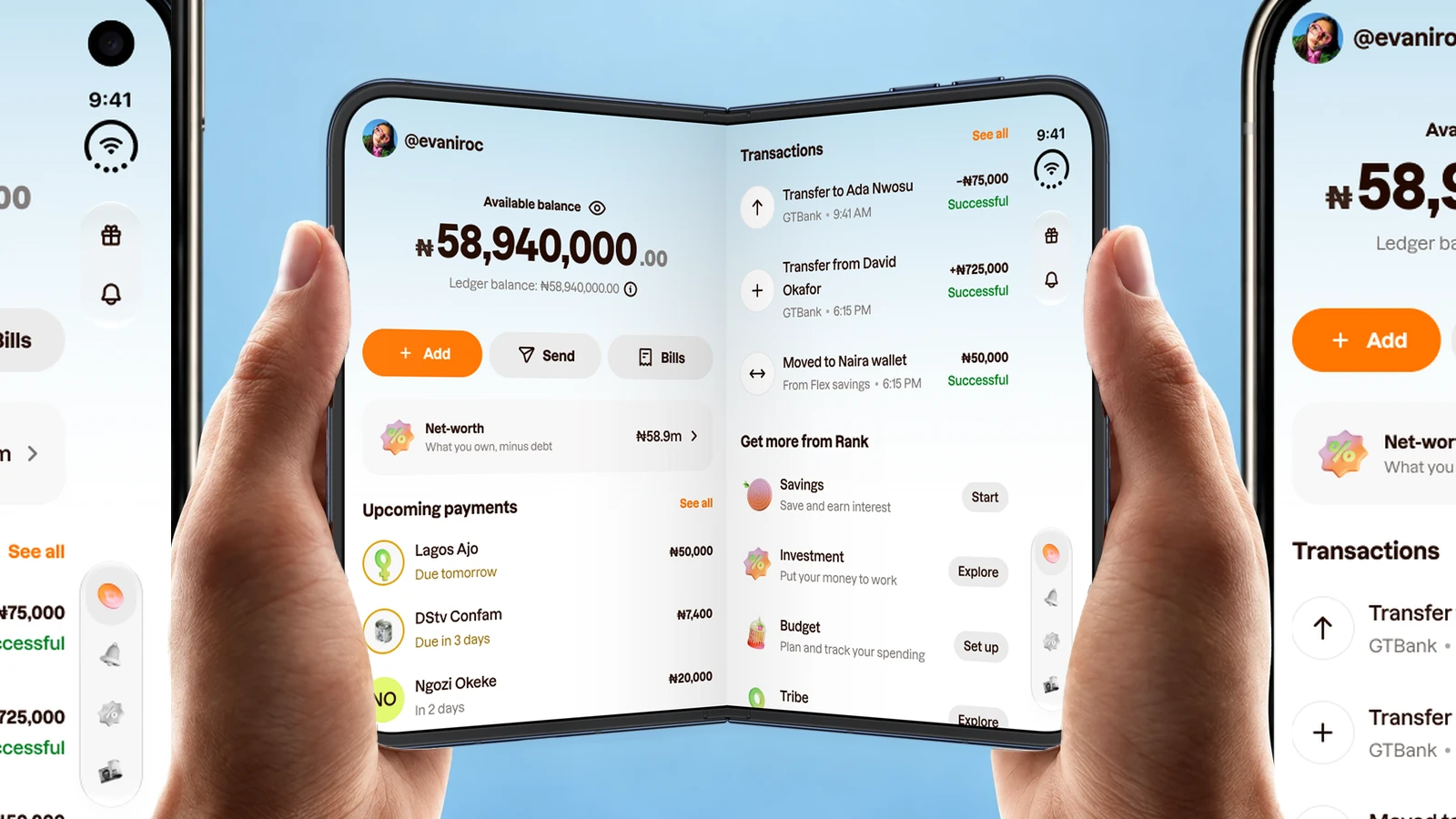
Apple’s iPhone Duo is a phone with two screens: a narrow outer display when it’s closed, and a wide inner one with a fold down the middle when it opens. Apple’s own apps rearrange themselves for both.
Rank draws its own navigation, so none of that comes for free. I treated Duo as a design-system problem and led how DS 3.0 scales to it.
At a glance
My role. Design lead for DS 3.0. I set the rules, adapted the components and designed the example screens.
The problem. Left alone, Rank runs phone-sized in the middle of the open screen. Redrawing every screen for two new shapes wouldn’t scale either: the app keeps growing, and every feature would need three designs.
What I did. Turned Apple’s geometry into layout variables, adapted 8 components and added a side rail, wrote 12 rules, and proved them on five real pages.
Where it is now. Designed and documented in DS 3.0, with the engineering contract written. The build comes next.
A phone that opens
The two screens aren’t a small and a large version of the same thing. Closed, Rank has one column, with its controls in a rail down the side. Open, the same moment gets twice the room and one more column.
And people move between them mid-task. You check your balance on the outer screen, open the phone to compare, close it to put it away. So the real requirement wasn’t two layouts. It was one app that never loses your place while its shape changes.
Measure before you draw
Apple’s guidelines explain the ideas but give almost no numbers, and the launch videos give none. My first pass used sizes measured from screenshots. They were close, and close isn’t good enough for a system: every component built on them would have been a few points off, and engineering would have built those errors in.
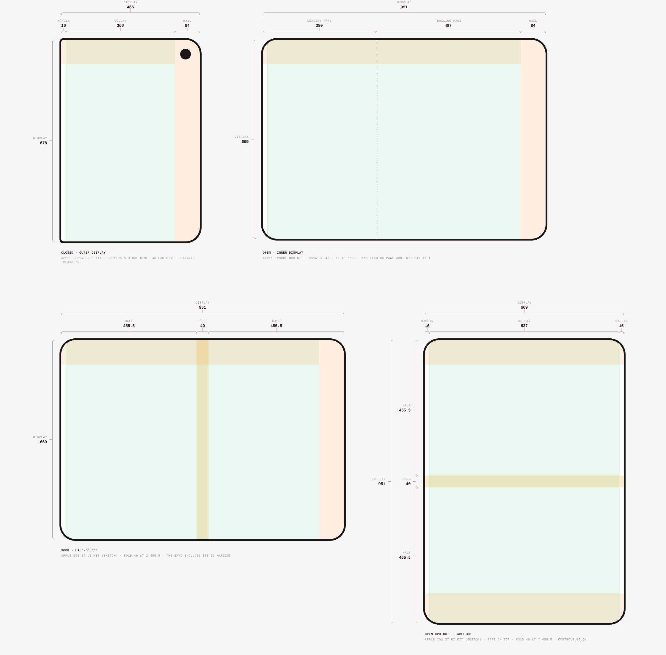
So I stopped, found Apple’s iOS 27 UI kit and rebuilt from its layout guides. It gave the real geometry: an 84 pt rail with a 48 pt column inside it, buttons at a 60 pt pitch, and a 40 pt band around the fold.
The system move. I turned that geometry into one Layout variable set with three modes: iPhone, Duo closed and Duo open. A frame gets the right margins, rail and fold by switching its mode, so nobody types 84 into a screen again.
The bars move to the side
On Duo, Apple moves every bar to the side. Rank draws its own, so I had a choice: keep Rank’s bottom bars, which was quicker, or follow Apple into a side rail.
Keeping them would have made Rank the one app on the phone that felt foreign, with a tab bar stretched across a screen you hold by its edges. So Rank gets a rail, lined up with the camera: the time, then Back, then the screen’s actions, and the tabs at the bottom. It still looks like Rank: our own glass buttons and 3D tab art, placed on Apple’s rhythm.
Three rules for the rail. A vertical bar only has room for icons. So Back stands alone at the top, related actions share one glass capsule, and overflow comes last. Anything with words, like a title, an amount or a Continue button, stays horizontal in the content.
The system move. These became variants of the bars Rank already had, not new components. The tab bar gained a vertical axis and a one-circle state for tasks, the status bar a side version, the top bar a title row. Every screen already using them could follow.
Colour carries on, text stops
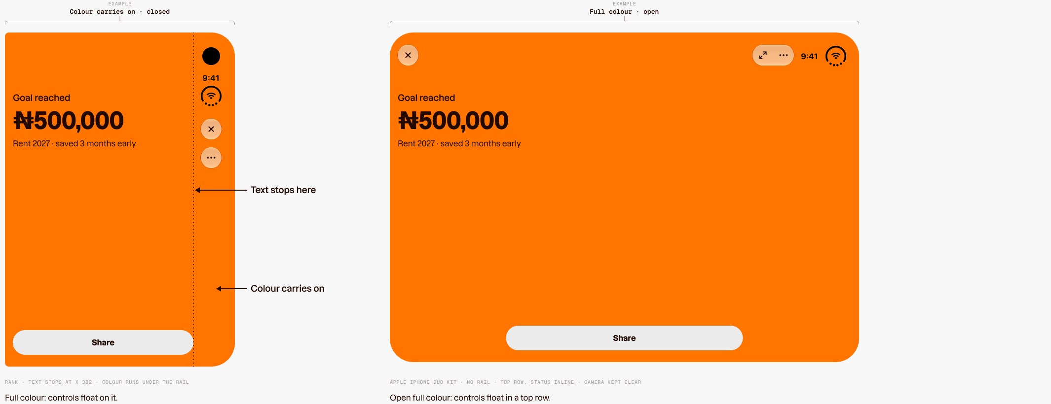
My first pass put a faint haze behind the bars, to separate them from the content. Watching real apps on the device showed the opposite: the rail has no surface. The screen’s colour and art run under it to the edge, and only text and controls stop at the rail.
That one rule made screens feel bigger instead of boxed in. It also gave every component a single edge to respect, which is easier to build and to review than a background that changes per screen.
One more column
The obvious move with a bigger screen is to make everything bigger. I didn’t want that: a stretched phone layout wastes the room and makes people move their eyes further for the same information. Apple’s model, and the one I set for Rank, is one more level of hierarchy instead.
Profile shows it best. Closed, it’s a list: tap Account limits and the limits replace it. Open, the list stays on the left and Account limits opens on the right, so you can move between settings without losing the list.
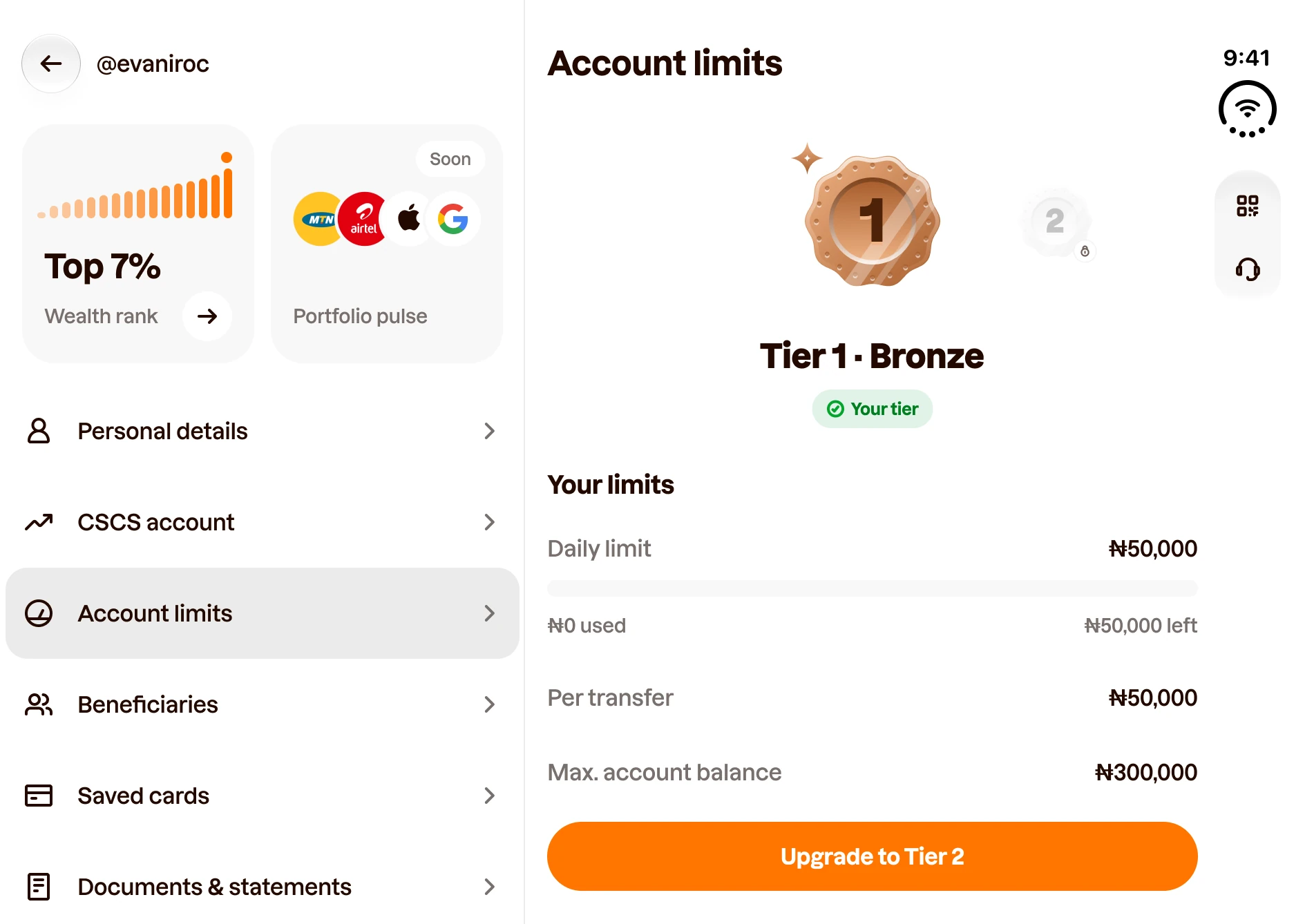
Closing keeps your place. The reverse matters just as much, and it’s the part people would notice if we got it wrong. Close the phone on Account limits and you stay on Account limits; Back takes you to the list. Nobody loses their place because they folded their phone.
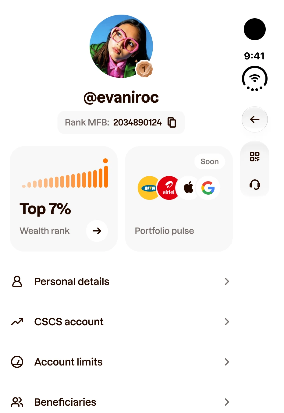
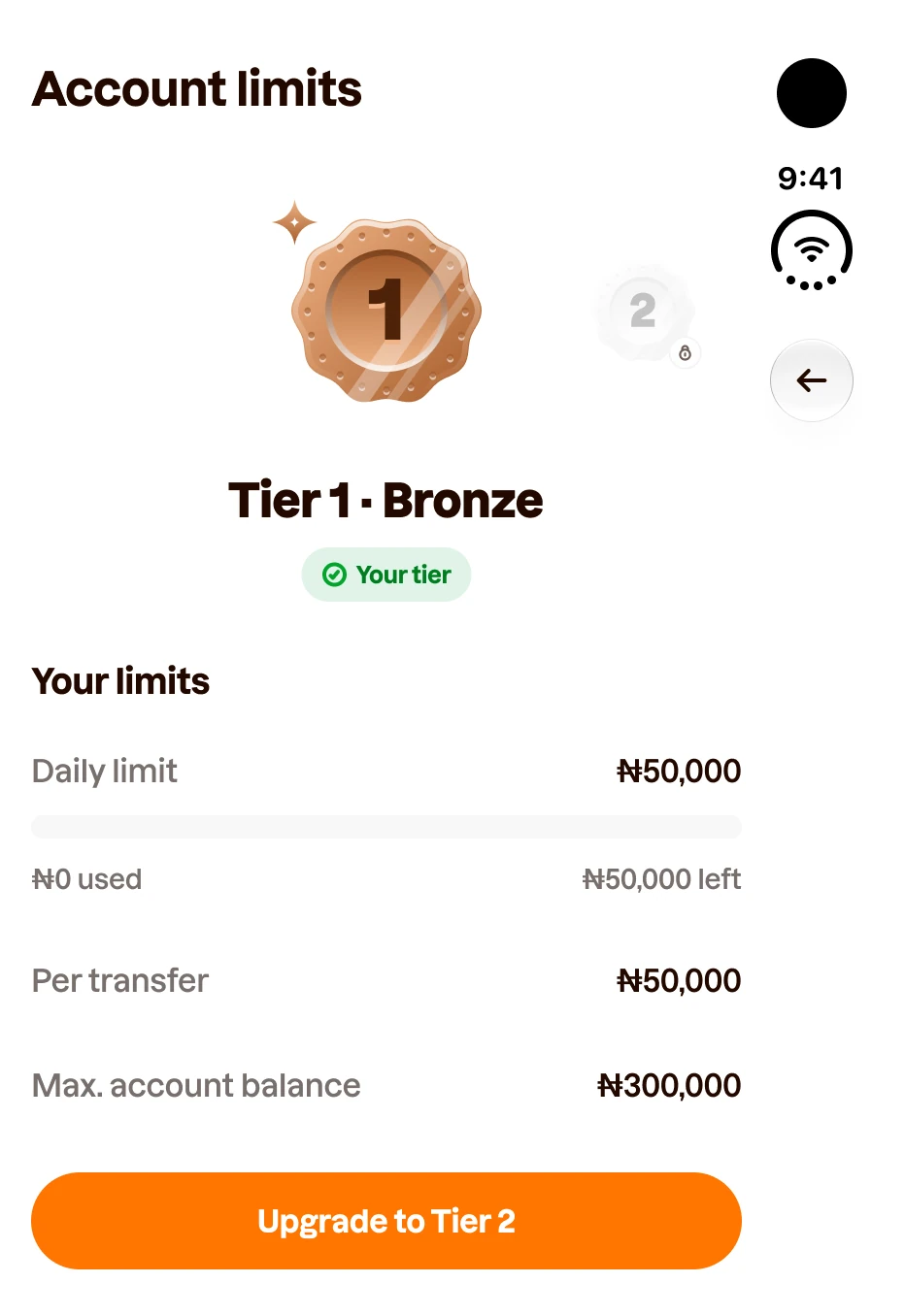
Two smaller decisions make this work. The left pane keeps its own top row, with Back to Home, because the rail serves the right pane. And text buttons like Upgrade to Tier 2 stay full width at the bottom of their pane, never squeezed into the rail.
Home, split on the fold
Home was the hardest page, because it isn’t a list and a detail. It’s two halves: the money you have, and what’s happening to it.
The first open layout split them at Apple’s sidebar width, like the other pages. On Home that broke in two ways. The money side ran out about 100 points before the bottom, and the hinge ran straight through the Transactions icons.
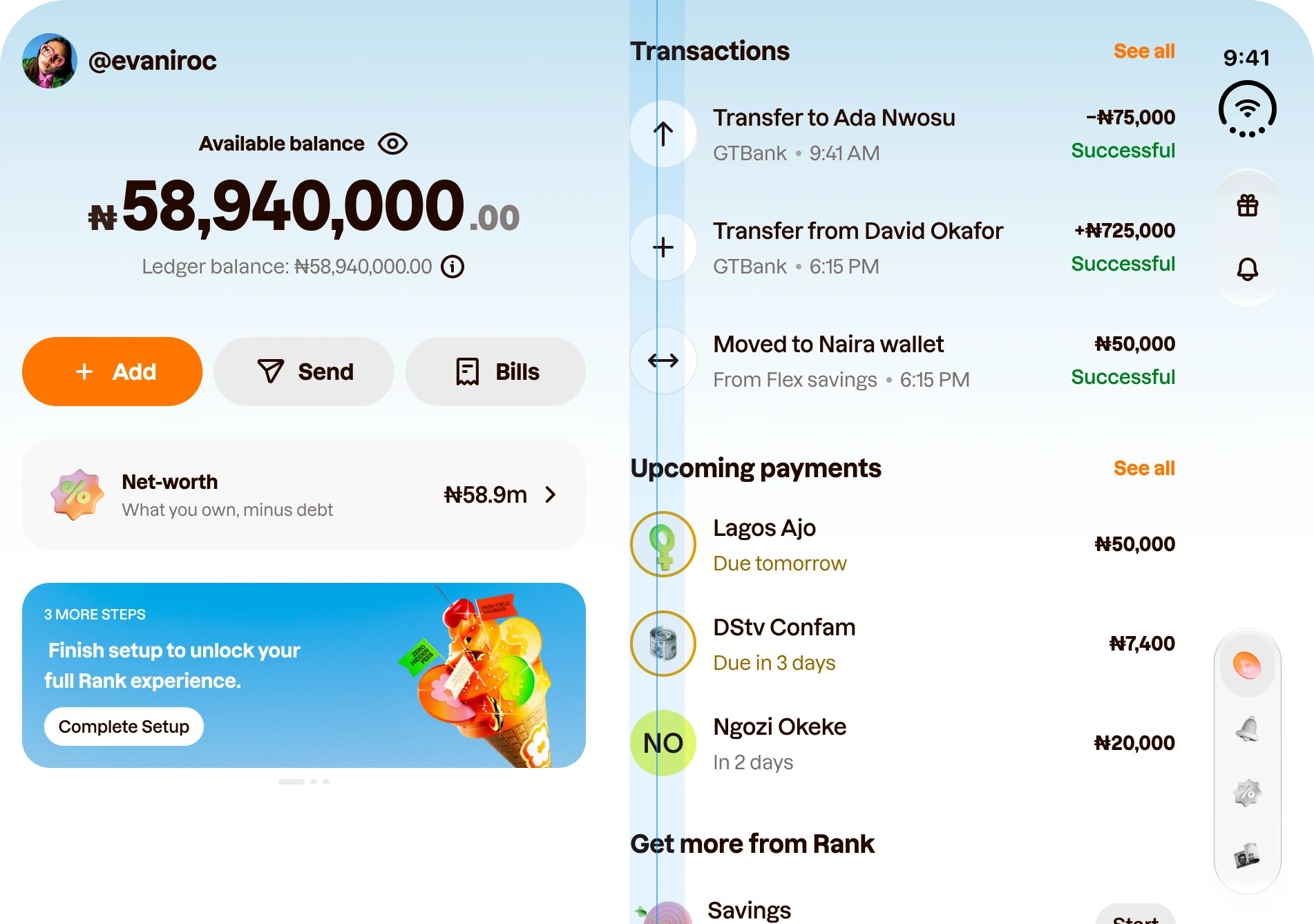
It would only get worse. The setup banner disappears once you finish setting up, so for most people a third of the money side would sit empty.
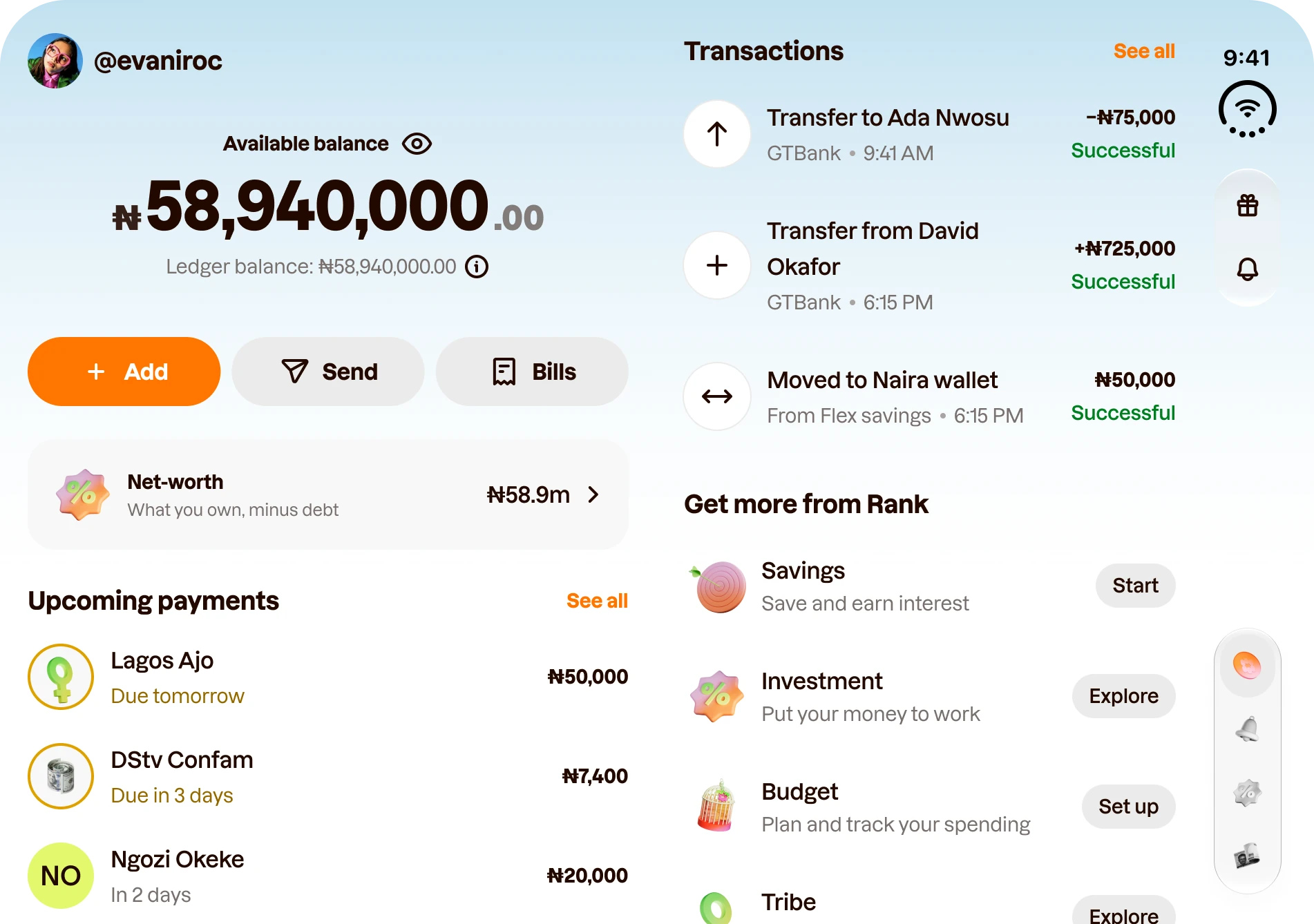
So Home splits on the fold instead. Money on the left: balance, Add, Send and Bills, Net worth, then Upcoming payments, because those are money that’s about to leave. Activity on the right: Transactions, then Get more from Rank. Nothing sits on the crease.
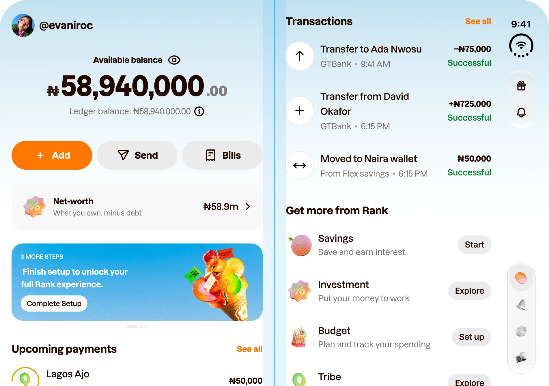
Then I checked the version most people will actually live with. Without the banner, Upcoming payments moves up and both halves still fill.
The trade-off. The activity side is narrower, so a long name like Transfer from David Okafor wraps onto two lines. I kept the type size and left the wrap as an open question, because shrinking text to fit a layout is the wrong way round.
Send money: a task keeps its actions
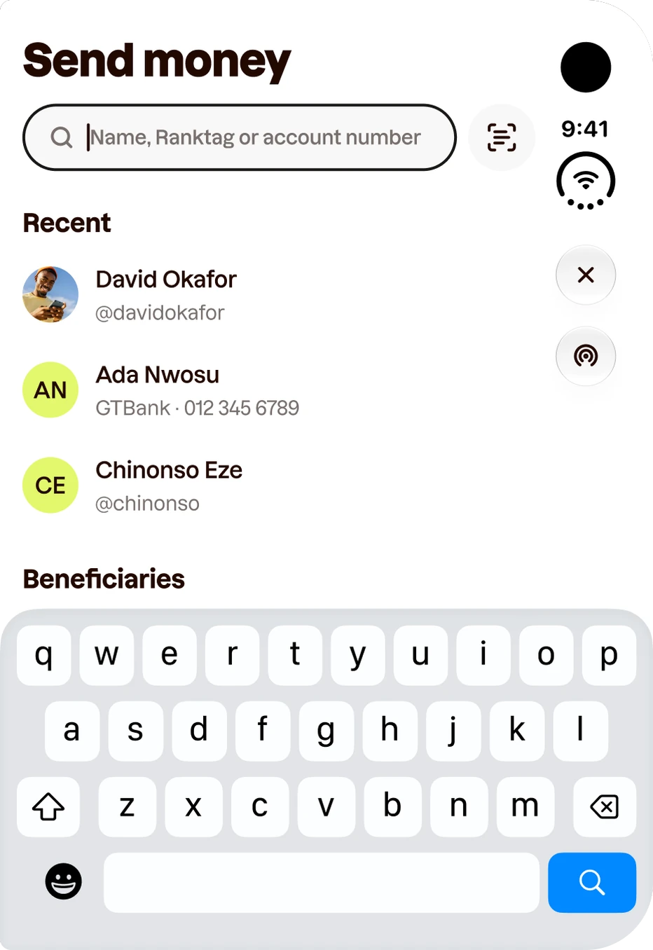
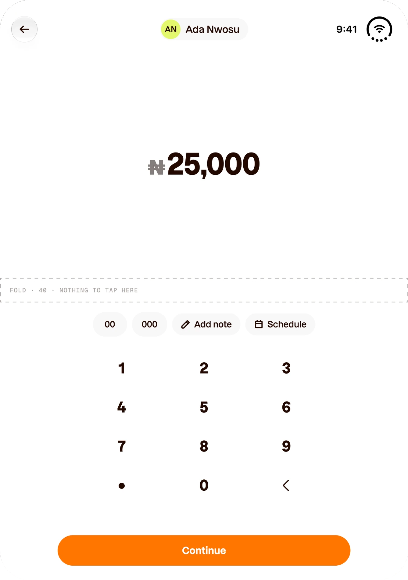
Send money is where the rail gets tested hardest, because a task can’t afford to lose its buttons. On the closed screen the tabs fold into a single circle and Close comes first, so every step keeps its actions in the rail.
That also buys room. With the header moved into the rail, the amount and keypad fit the closed screen. With a header row on top, they’d need about 712 points of a 678-point screen.
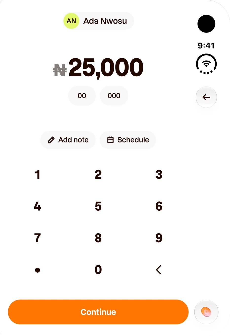
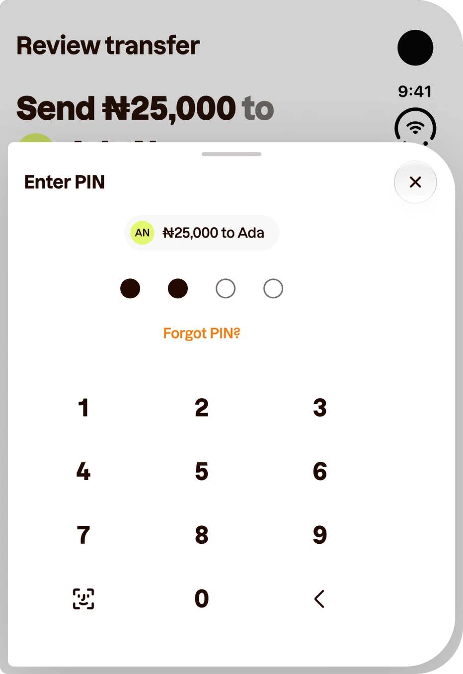
The PIN follows Apple’s floating sheet: 8 points in from every edge, with its own Close in its own rail. Half-folded on a table, who and how much sit in the top half; the chips, keypad and Continue lie flat in the bottom half, below the fold.
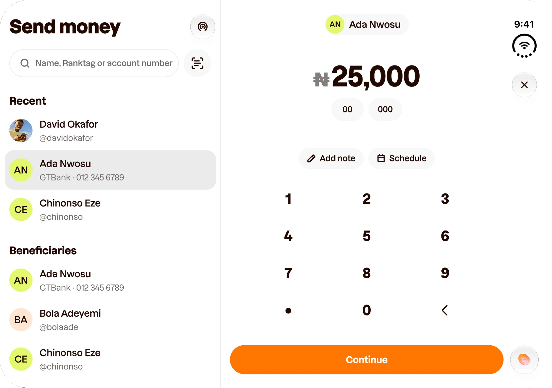
Open, Send gets its extra column: recipients on the left, the amount on the right. Pick someone and type; close the phone and you keep the amount, and Back returns to the list.
Every state, the same rules
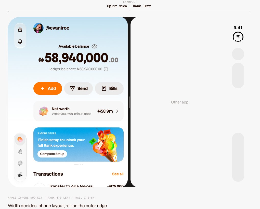
Two rules cover the states in between. Half-folded like a book, each pane takes one half and nothing you tap sits in the 40 pt band: lists may scroll across it, buttons stay clear. In Split View beside another app, Rank is narrow, so it gets the phone layout with its rail on the outer edge.
Width decides, never the pose. I wrote every rule around the space Rank has, not the device it’s on. That keeps Split View working, and it means the same rules hold on tablets and Android foldables.
Pages that bend the rules
Rules only count if they survive the awkward pages, so I tested them on the two most likely to break them: a page where the screen itself is the product, and a page whose navigation is made of words.
My code: the screen is the product
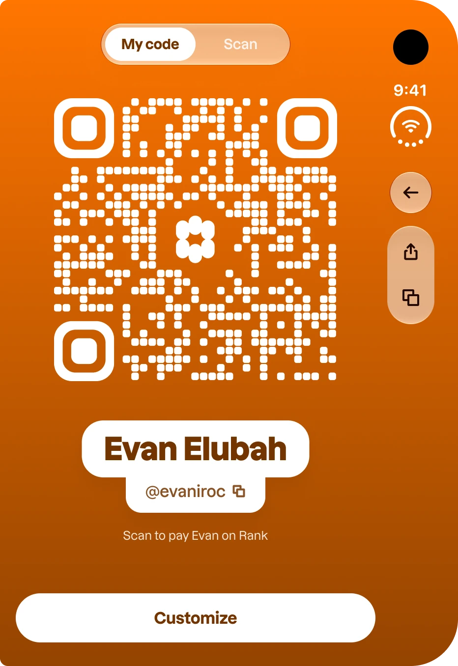
On a phone, My code is a big QR code you hold up for someone else. On Duo, three things work against it: the rail takes width, Customize covers the code, and the person scanning might be across a table.
Closed, the code’s colour runs under the rail so it still feels edge to edge. Back stands alone, and Share and Copy Ranktag share one capsule. Customize rises full width under the rail, like the keyboard does, so the code stays visible above it.
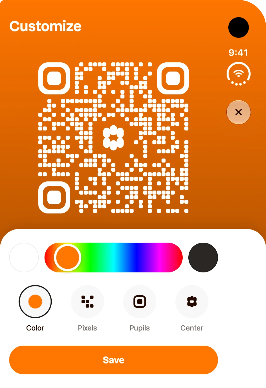
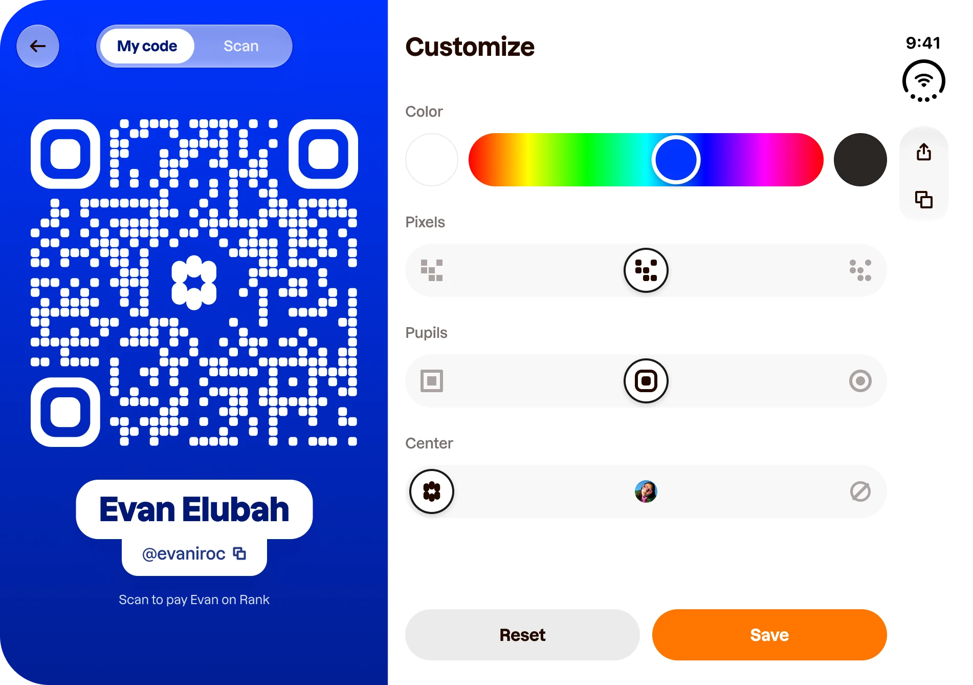
Open, there’s finally room to stop hiding things. The code stays big on the left and all four Customize controls sit open on the right: no tabs, no panel, every choice one tap away.
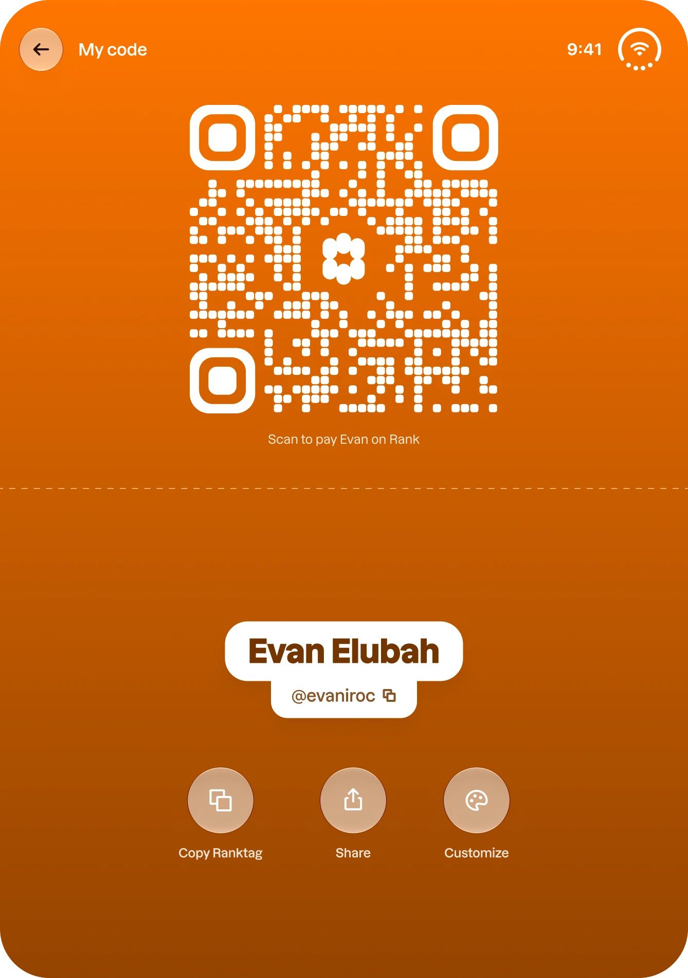
Half-folded on a table, the phone becomes a little stand. The code stands in the top half, facing the person scanning, and your buttons lie flat in the bottom half, facing you.
For you: words don’t go in the rail
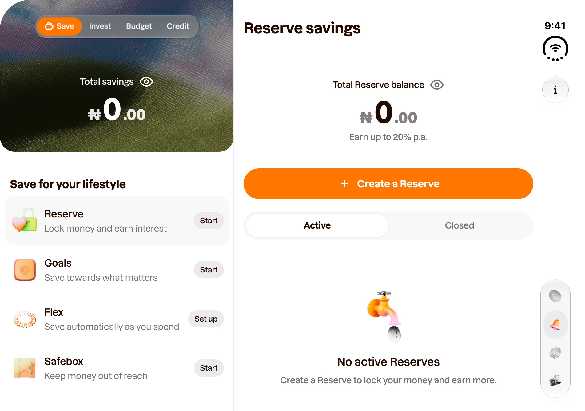
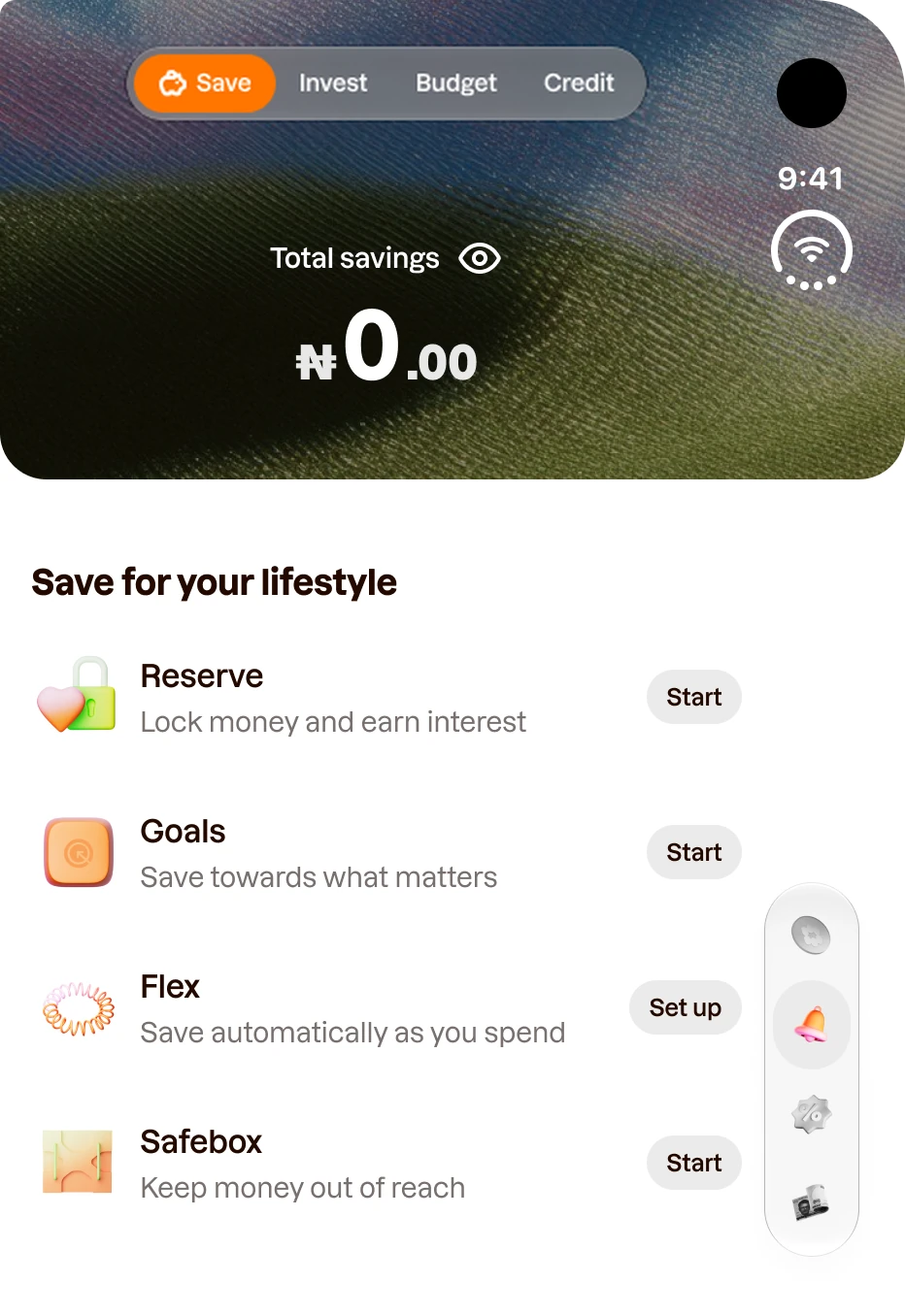
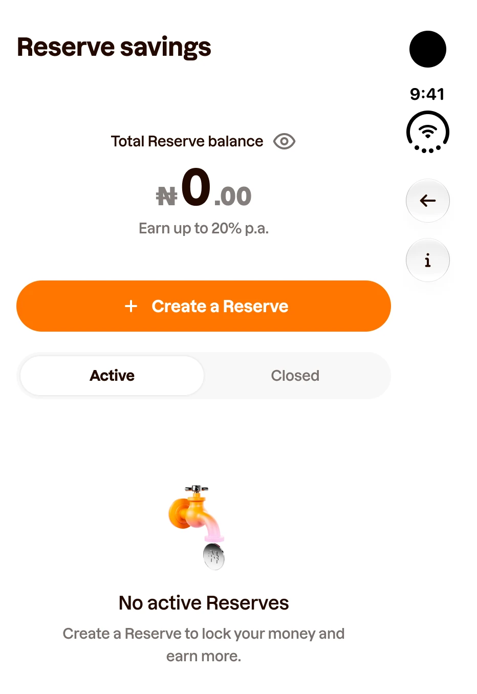
For you puts four products behind a switch: Save, Invest, Budget and Credit. On Duo, a switch like that looks like navigation, and navigation moves to the rail. But the rail only takes icons, and these are words.
I drew both answers. A keeps the switch in the content. B turns the four categories into a sidebar on the left.
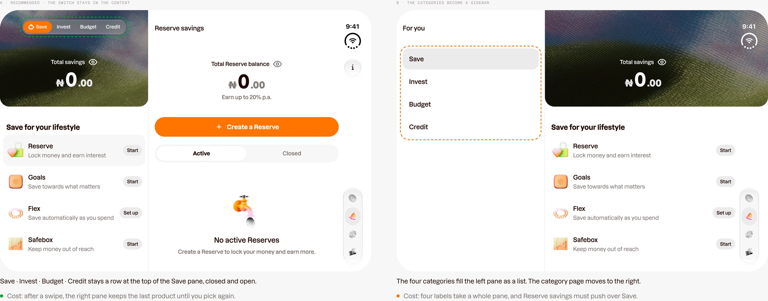
B looked tidier, but it gave four short labels a whole pane and pushed Reserve savings over Save. A keeps Save on screen and costs one thing: after a swipe, the right pane holds the last product until you pick again. We went with A, so the switch stays a row at the top of the Save pane, closed and open, and swipe still works.
Scaling the system
None of this lives in one-off screens. There are twelve rules, grouped by what they govern: the rail, the space, the edges. Each one is drawn the right way and the wrong way and says where it comes from, Apple’s kit or Rank’s own call, so the next designer can apply it without asking me.
Then I checked every component against Duo. Of the 23, 15 work as they are. The other 8 got Duo variants inside their existing components.
Why variants, not new components. Every Rank screen already uses these components. With a Duo variant, a screen adapts by switching a property instead of being redrawn, and engineering maps one property instead of rebuilding a part.
Light and dark come along for free: the Duo variants use the same colour tokens, so a screen flips modes on either display with no extra work.
Built to be built
A system only scales if engineering can build it the same way. Rank draws its own UI, so Apple’s automatic adaptation doesn’t reach it: the app has to read the phone itself.
I wrote that down as one layout contract with four facts: the inset on each edge, which edge the bars belong to, the reserved regions, and the hinge state. Screens read those facts instead of checking which device they’re on. That’s what keeps Split View working, and Android foldables already report the same fold.
Impact
The goal was never a Duo version of Rank. It was one Rank that knows how much room it has, and a system the rest of the team can keep building on.
It’s designed and documented in DS 3.0, and the build comes next. Once it ships, one number tells me it worked: how many new screens still need their own Duo design. The target is none.
Next: Android foldables, on the same rules.